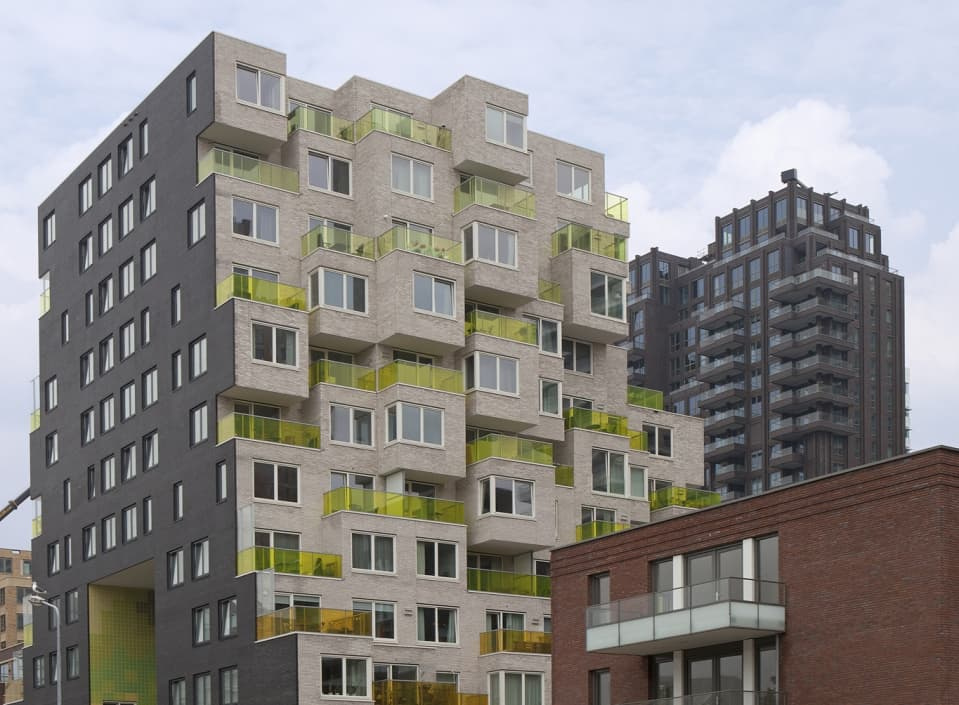
Amsterdam, Summertime
Country: NederlandCity: Amsterdam
Project name: Summertime
Type of building: New building
Type of construction: Residential
Contractor:
BAM Wonen Urban Up (AMSTERDAM ZUIDOOST)
Architect:
UNStudio Holding BV (AMSTERDAM)
Summertime has many faces, from rental homes to parking places to various facilities covering 1100 m². It is striking, colourful, sleek and there is an eye-catching role for aluminium detailing.
SLEEK ALUMINIUM DETAILING AT SUMMERTIME

Amsterdam’s Zuidas is the domain of major banks, multinationals, law firms and consultancy firms. All this only began in the mid-1990s with the arrival of ABN Amro. Since then, the area along the A10 has experienced tempestuous growth. It boasts the most expensive square metres of office space in the Netherlands, a wide range of facilities, and homes in the more expensive segment. In order to create a varied and lively neighbourhood, affordable housing has also been built. One of the first projects in this segment is Summertime, located between Gustav Mahlerlaan and George Gershwinlaan. It includes two residential blocks with 196 rental homes, 150 underground parking places and 1100 m² of facilities on the ground floor. The ambition was to create a building that was sustainable but also affordable and beautiful. In construction ‘beautiful’ and ‘affordable’ usually clash, but not at Summertime. Developers AM and Bouwinvest, architectural firm SeARCH and builder BAM Woningbouw have pulled out all the stops to produce a ‘Zuidas-worthy’ result: striking, austere, colourful, with a nod to the financial world, and with a striking role for aluminium detailing.
Two faces
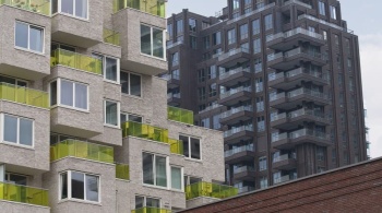
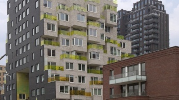
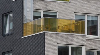
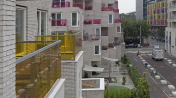
“Summertime consists of two buildings with two faces,” says architect Jaap Baselmans. He now works at UN Studio, but at the time was part of the SeARCH design team led by Bjarne Mastenbroek. “On Mahlerlaan and Gershwinlaan you see austere black facades that with their abstract effect fit in with the neighbouring metropolitan buildings. On the other side the buildings are very lively and colourful. The buildings taper off towards each other so all the apartments can benefit from maximum sightlines and sunlight.”
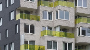
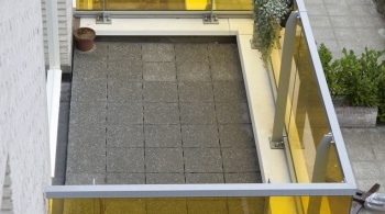
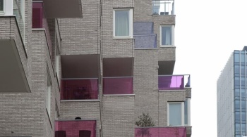
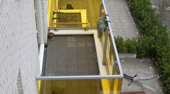
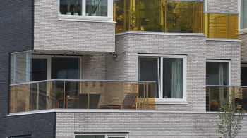
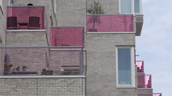
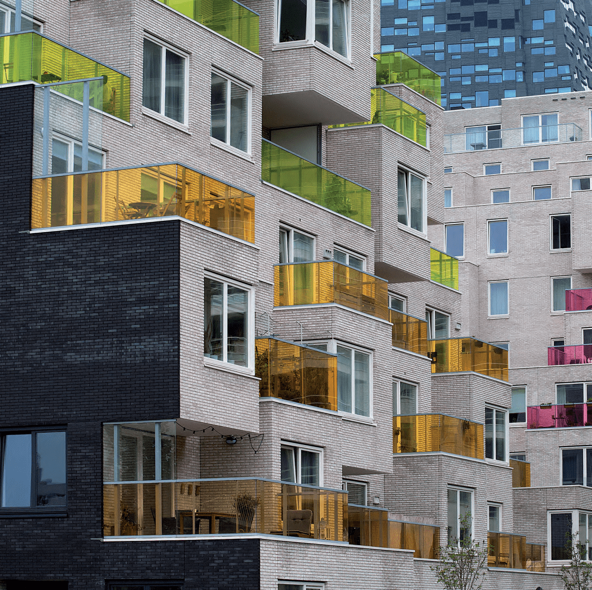
The individual apartments have been made recognisable as ‘pixels’, cubes with the same bay size that are stacked seemingly at random and equipped with colourful glass balcony screens. Baselmans: “When the sun moves through those balcony railings it really starts to live, and that was exactly the intention. The stacked structure was inspired by Habitat 67, a famous housing project that was part of the 1967 World Fair in Montreal.”
Wink
Another source of inspiration was money. Baselmans: “For the colour scheme, and as a nod to the financial world, we took two well-known old banknotes: the 250-guilder lighthouse for the block on Mahlerlaan and the 50-guilder sunflower for the southern block. The lighthouse and the sunflower can be seen as pixelated tiles in the high entrance loggia and entrance portal respectively. Each building contains 52 coloured tiles of St. George. This was a typical subject where you had to come to an agreement with all parties in order to keep it beautiful yet affordable. The glass balcony railings of both blocks are executed in the two colour groups: lilac and yellow-green.
The third version of the colours can be found in the interior, in particular in the block on Mahlerlaan. Baselmans: “It has a horseshoe-shaped floor plan and a high tapering central void with a large aluminium skylight. The gallery railings and the front doors all have a gradient in the colour of the banknote: lilac at the bottom and increasingly whiter towards the top. This colour scheme required a lot of consultation and patience from all parties involved. This applies even more to the ultra-sleek, colour-coated fencing in the void. These louvres are not supplied in this length by default. We had to fight to keep these special elements in the plan, which were more expensive. But if you look at it now, everyone can see that it was worth it!”
“On the outside we made concessions again. Bjarne Mastenbroek wanted real black and real white in the exterior walls. Black worked out well: these walls have been beautifully constructed with matt black brickwork, black window frames and custom-made aluminium sills. For the white façades, glazed or white engobated extruder stones proved too expensive. We opted for a hand-moulded brick, the whitest we could get. A lot of time was also spent on the detailing of the cubes to make them as sleek as possible at the top and the bottom. Then we focused on matching the brick, lintel, window frame, ceiling finishes and, of course, all aluminium façade finishes.”
Aluminium façade detailing
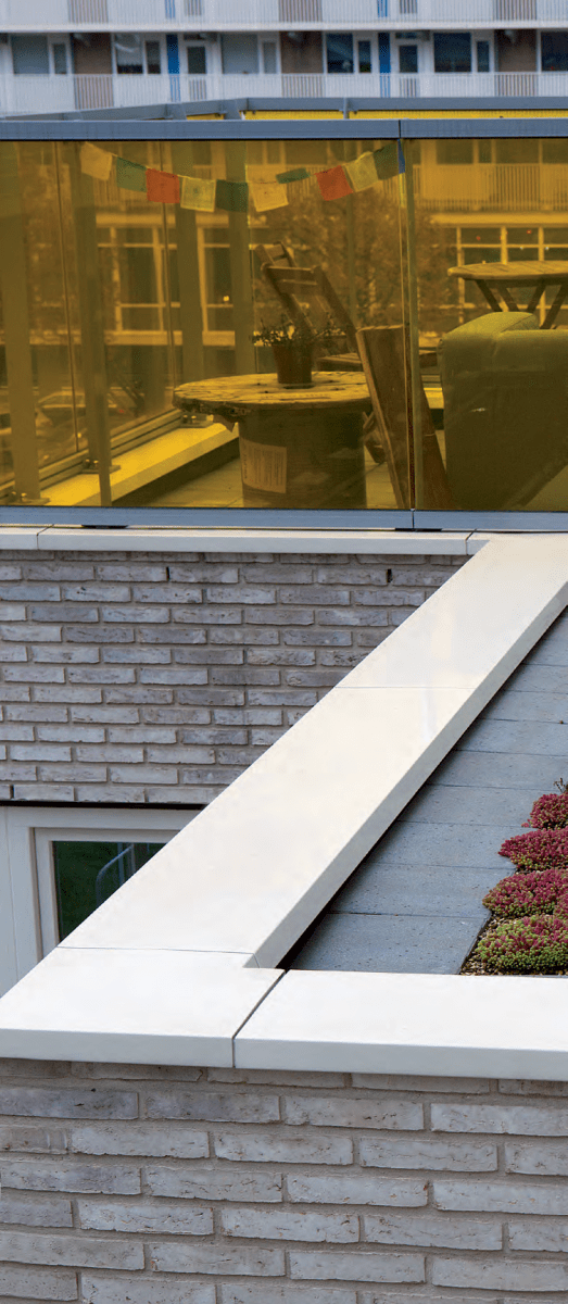
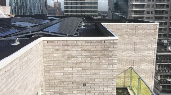
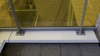
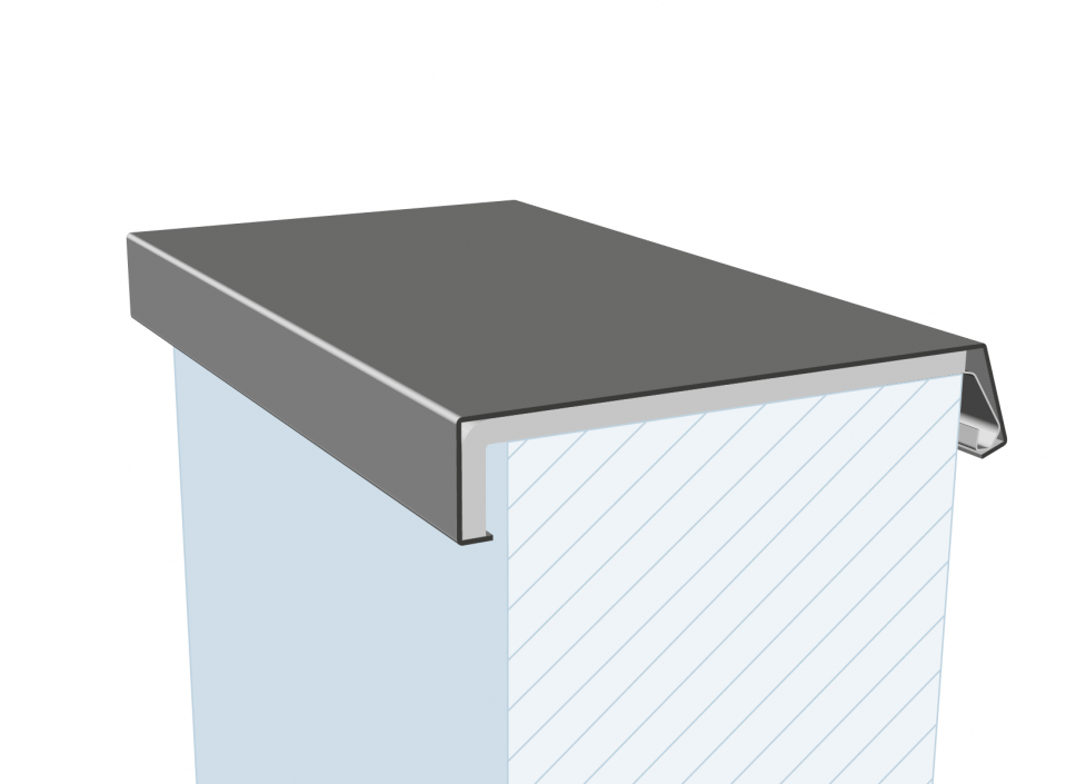
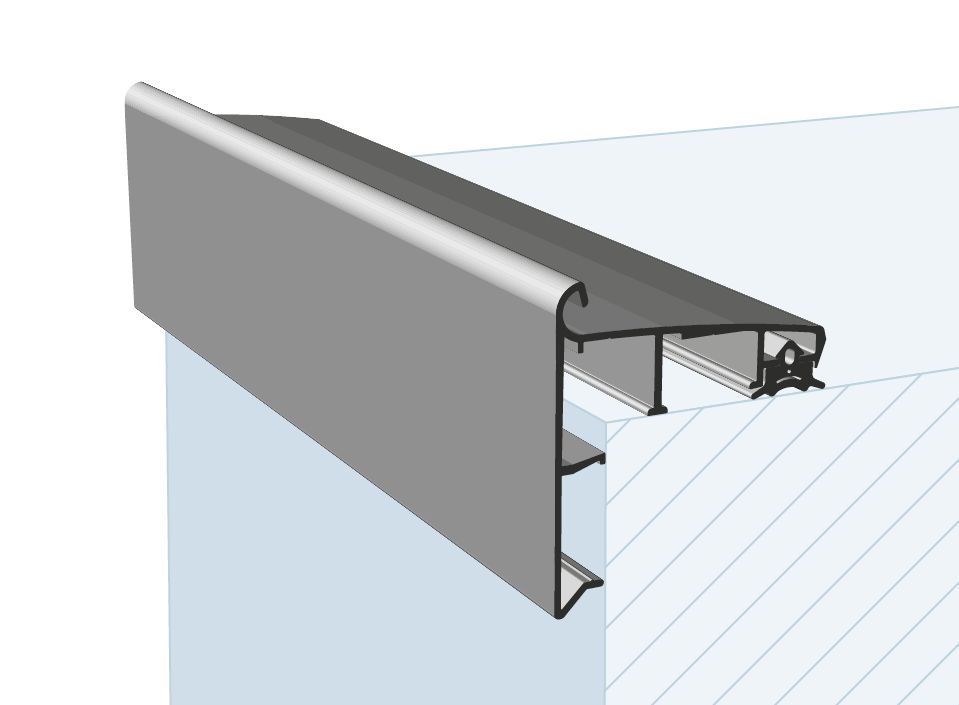
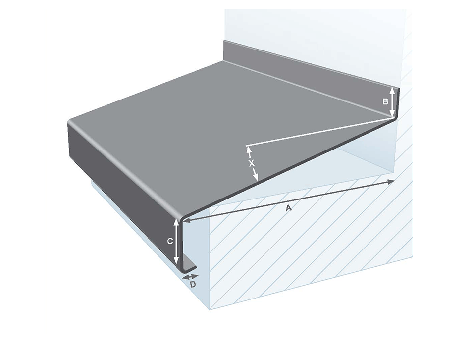
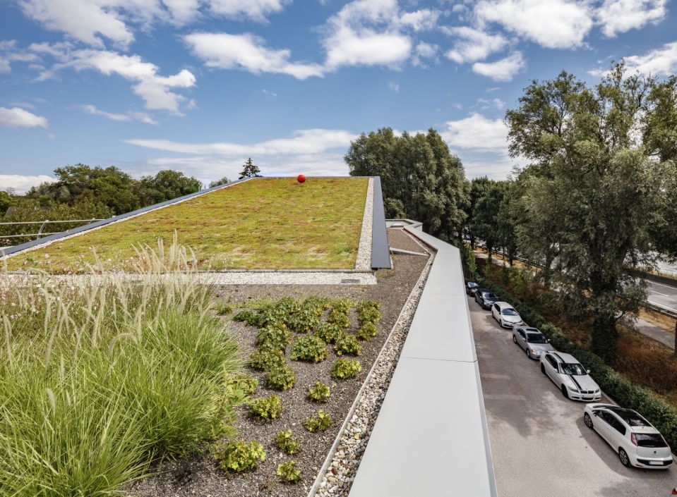
A lot of aluminium façade detailing can be seen in this beautifully designed project. It is clear to see that the aluminium wall coping systems, which have been used extensively, and the aluminium sills and roof edges contribute to the building aesthetics by accentuating the clean lines. Baselmans: “Aluminium is highly mouldable so you can use it for sharp detailing.” The detailing for the top side was just as critical as for the bottom side of the cubes. Baselmans says the following about the importance of aluminium detailing: “All the cubes have an aluminium roof edge. Water that runs along the façade spreads at the interruptions. If the detailing is wrong there you run the risk of leak marks, and that is annoying on such a white façade. That is why all aluminium sills, wall coping systems and aluminium roof edges are not only essential for the sleek appearance of the façade, they also ensure proper drainage for the building. The importance of this cannot be underestimated: all the aluminium profiles are colourfast, and they protect the façade against all kinds of deposits and green streaks. With a building like this, it’s really about the detailing; you will benefit from it in the long run. Aluminium is also durable and low-maintenance, which is not unimportant to say the least, in projects where you also have to watch your finances during the maintenance phase.”
