Arnhem, Island homes on Zuydereiland
Country: NederlandCity: Arnhem
Project name: Eilandwoningen Zuydereiland
Type of building: New building
Type of construction: Residential
Contractor:
Heilijgers bouw BV (AMERSFOORT)
Architect:
MIX architectuur BV (EDE)
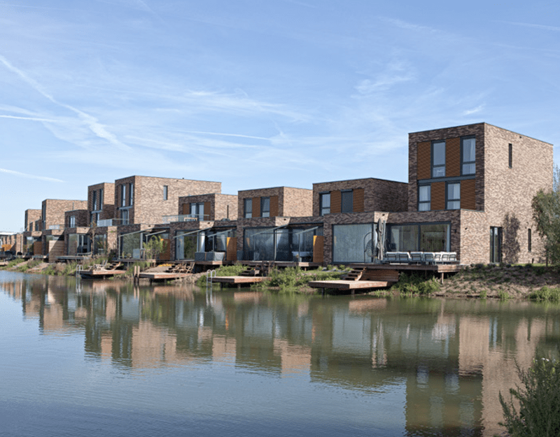
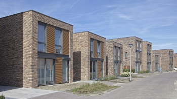
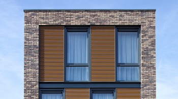
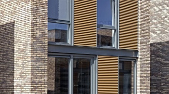
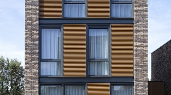
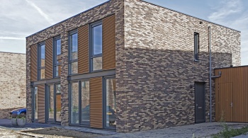
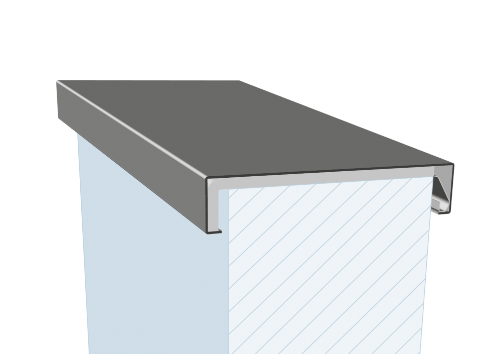
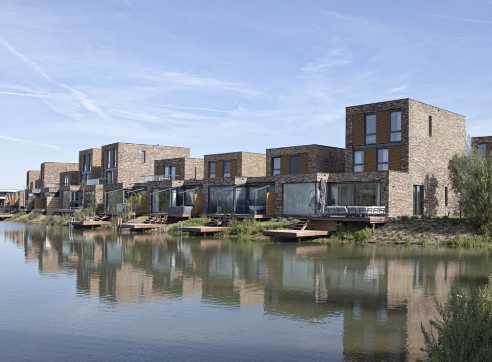
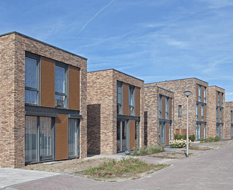
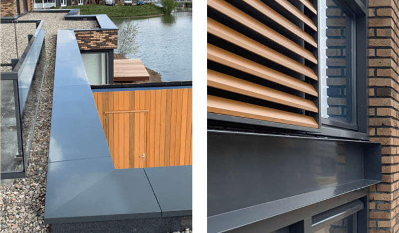
The 19 island homes together form a cubist whole. Sturdy masonry frames combined with the checkerboard pattern on the façades create a uniform appearance. Aluminium coping has been used for the roof edges, and aluminium fascia boards separate the storeys.
HIGH-TECH ALUMINIUM CONTRASTS WITH THE VOLUME
‘Have you been to the hairdresser’s?’ That’s what you don’t want to hear if you’ve just returned from the local hairdresser’s. ‘Your hair looks great’, sounds much better. Especially if the compliment is not at all related to the hairdresser’s visit. That is exactly what is happening with the 19 island houses on the Zuydereiland in the Arnhem district of Schuytgraaf as work by architect Reinier Ubels of MIX architecture from Ede. Simply remarkable or remarkably simple. Both are true. It is the perfect hairdo: organically balanced, nuanced by use of colour and materials, accessible due to the simplicity of the cubist design.
Residents involved in the design
“The residents were closely involved in the design,” says Reinier Ubels. “The island homes consist of flexible modules in which they had freedom of choice. This was within a fixed framework of course, which guaranteed an organic, meandering façade image. That worked out well. The choice included one or two storeys with or without a roof terrace, which could also vary in size. There was also room for interpretation that lasts a lifetime.”
Living experience
To avoid massiveness in the ensemble and reinforce the individual character of the residences, the two rows of houses are broken up by broad vistas. There is always a view of the pond. Reinier Ubels: “This contributes to the living experience. The side façades of the water villas are closed; the orientation from the living room is double-sided and strongly focused on the natural and water-rich environment. The houses are connected to each other by wooden decking with a rotating privacy screen so you can enjoy a drink on your own terrace in complete freedom. And if you feel the need to stay in contact with your neighbours, you can simply turn the privacy screen inward.”
Robust. Or not?
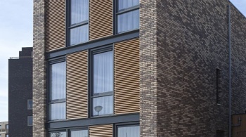
The residences are characterised by sturdy brickwork frames. Two colours of brick have been used for the dwellings, which create a certain tranquillity. The checkerboard pattern in the façade - the alternation of glass surfaces with aluminium louvres - ensures uniformity. The dwellings are described as robust, but is that really the case? It is a description that doesn’t do justice to the design. The subtle use of colour in the brickwork and the large expanses of glass, together with the aluminium detailing, provide a much more nuanced image. Reinier Ubels: “The use of high-tech aluminium detailing and the transparency of the glass run counter to the robust volume.”
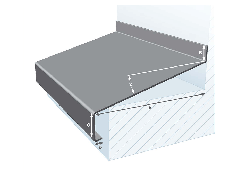
And that’s just how it is. For the finish of the roof edge, the architect chose aluminium wall copings. The sills are also made of aluminium. The upper floors are accentuated by aluminium fascias in a U-profile. It makes the design comprehensible and accessible. “Beautiful clean lines were created with the malleable aluminium. That is also an advantage of aluminium. You can use it for fine detailing”, says Ubels. “Moreover, unlike wood, aluminium is colourfast and requires little maintenance. This particularly applies to the orange-brown aluminium louvres which have a clear relationship with the wooden decking and garage doors.”
In short, an unequivocal characterisation of the island residences is not really possible. What matters most is the coherence between all the elements. The closest you can come is: ‘Gosh, your hair looks good’.
