Utrecht, Terwijde shopping centre
Country: NederlandCity: Utrecht
Project name: Winkelcentrum Terwijde
Type of building: New building
Type of construction: Residential building and utility project
Contractor:
Smit's Bouwbedrijf BV (BEVERWIJK)
Architect:
Ponec De Winter BV (AMSTERDAM)
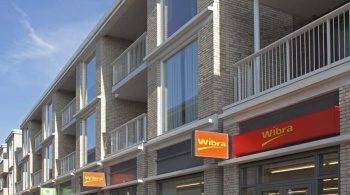
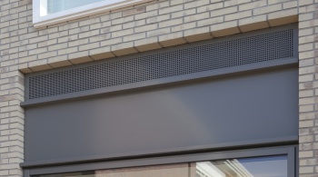
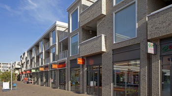
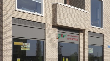
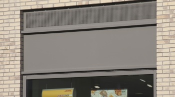
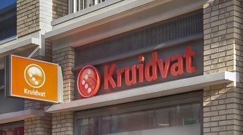
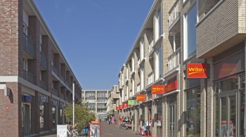
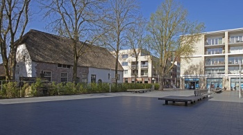
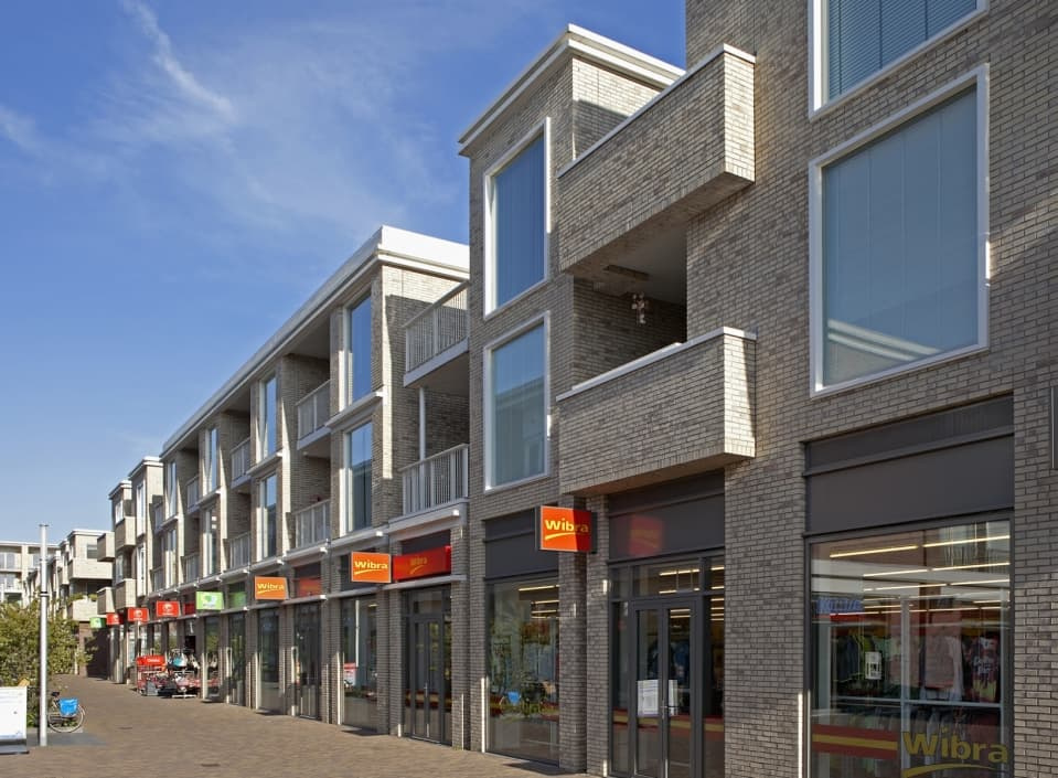
New Utrecht shopping centre with apartments above. Paying careful attention to the functionality of the complex, colour scheme and materials. To maintain unity in advertising, aluminium design panels have been fitted above the shop fronts.
DESIGN PANELS AS ALUMINIUM PAINTINGS

You have a meadow, and you have to do something with it. That’s a rather simplistic way of putting it, but that’s what it comes down to. The new Terwijde Shopping Centre in Utrecht, Leidsche Rijn, with some 40 shops, catering establishments, apartments and parking facilities, was built in a former agricultural area so the architect had to create the context. The total project, which fits in well with the low-rise buildings in the area, comprises several blocks, two of which are rental properties with shops underneath. The project was designed by Dana Ponec and Katja de Winter from the Amsterdam architectural firm Ponec De Winter. A great deal of attention was paid to the functionality of the complex and the colour scheme in combination with the incidence of light and materials, such as the use of a light and red-brown façade brick and aluminium detailing.
Fresh optimism
“It has become a pleasant neighbourhood centre with fresh optimism,” says Dana Ponec about the project. “Good cooperation with the architects of the other blocks has resulted in uniformity. The human scale is constantly visible.” The rental apartments above the shops are designed to last a lifetime and - with an eye to the future - can be partitioned as required. The partition walls can be moved relatively easily. This makes the flats very suitable for all stages of life.
Balconies
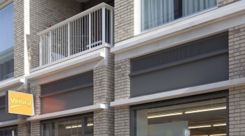
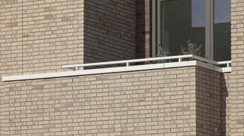
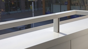
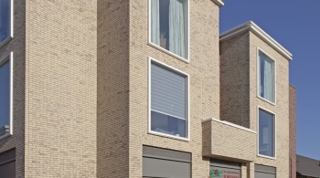
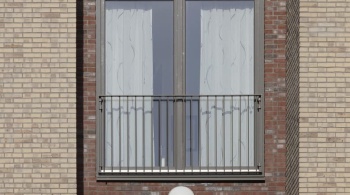
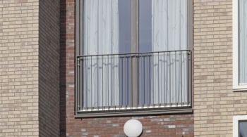
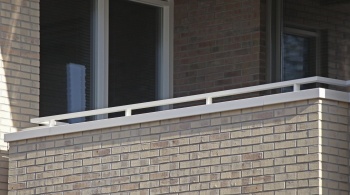
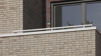
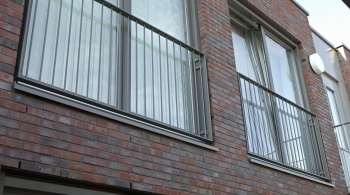
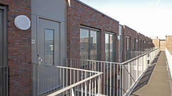
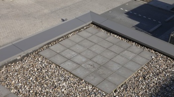
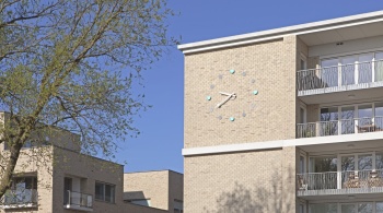
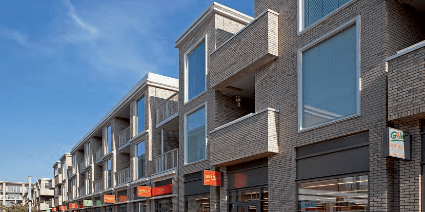
A striking feature of the apartment blocks designed by Dana Ponec is the light-coloured facing brick and the diversity of outdoor spaces. Balconies with a brick parapet protrude slightly from the façade while other outdoor spaces are slightly recessed in the façade and closed off with aluminium fencing. These outdoor spaces are designed to offer sufficient privacy. But that’s not all. Dana Ponec considers these outdoor spaces to be real outdoor rooms because there is a diagonal view from inside to outside and vice versa. A special detail is the robust concrete roof edge which very clearly ends the façade.
Light
The relatively large windows are also remarkable. Not only do they allow a lot of incident light, they also create a transparent façade image. Light plays an important role in Ponec’s design. “The slightly protruding balconies in combination with the light-coloured facing brick create a pleasant shadow effect. The light brick, combined with a reddish-brown facing brick, is used throughout the shopping centre to achieve uniformity.”
Aluminium
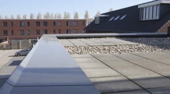
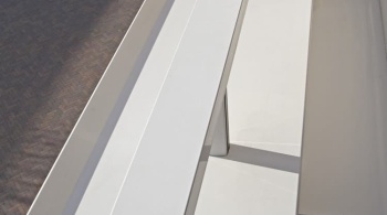
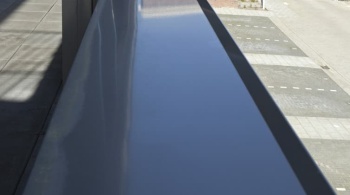
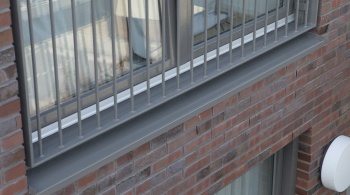
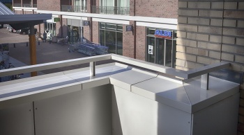
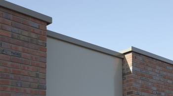
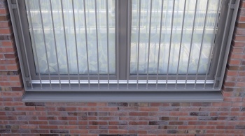
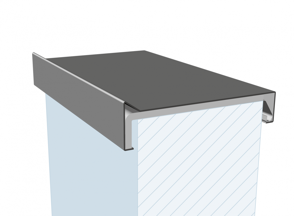
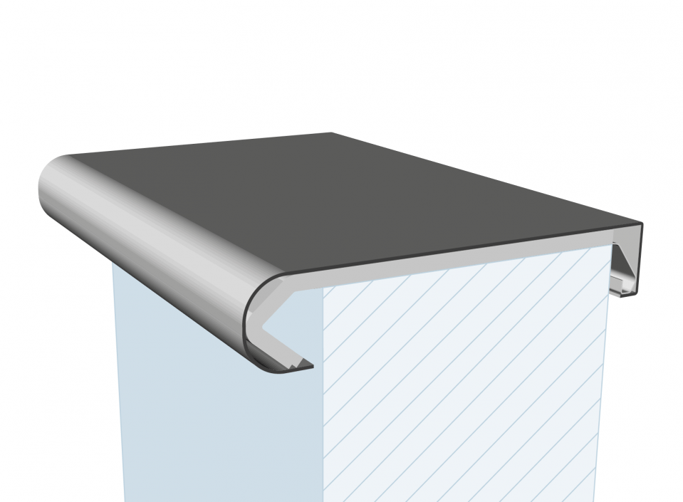
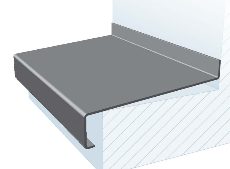
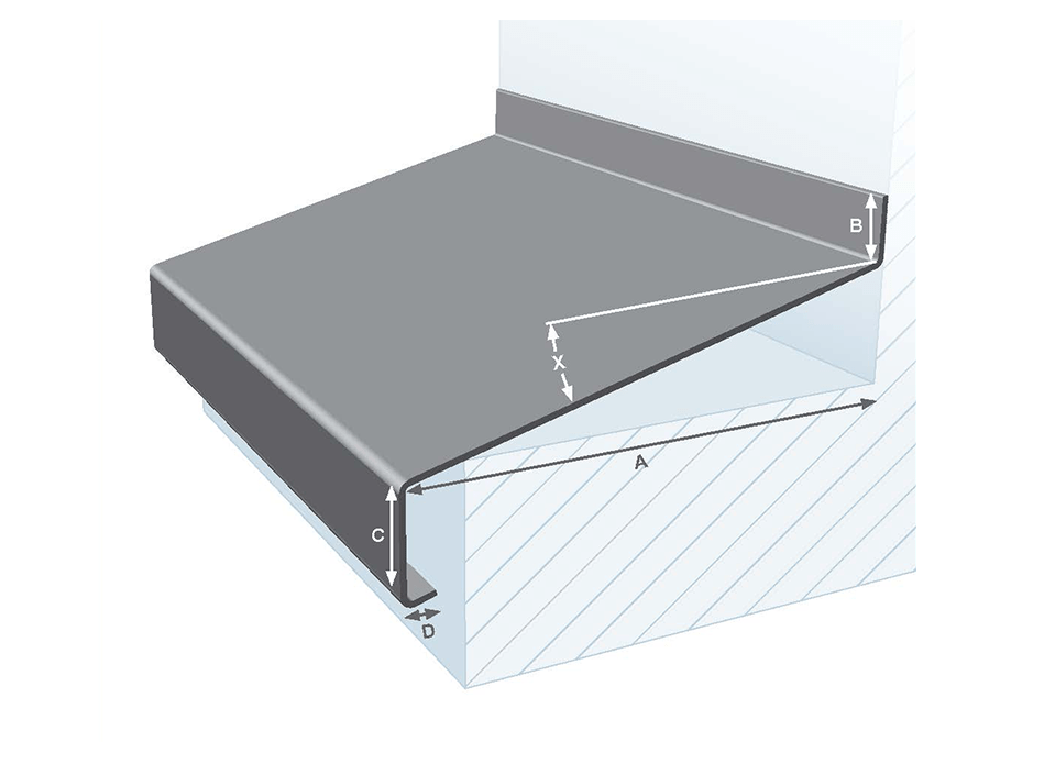
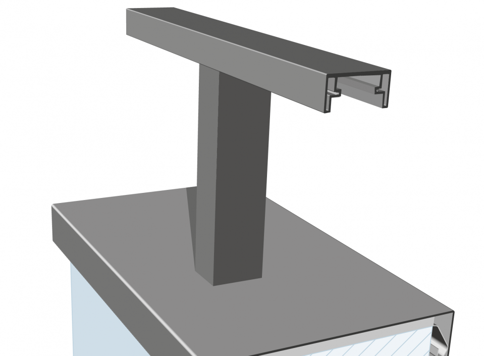
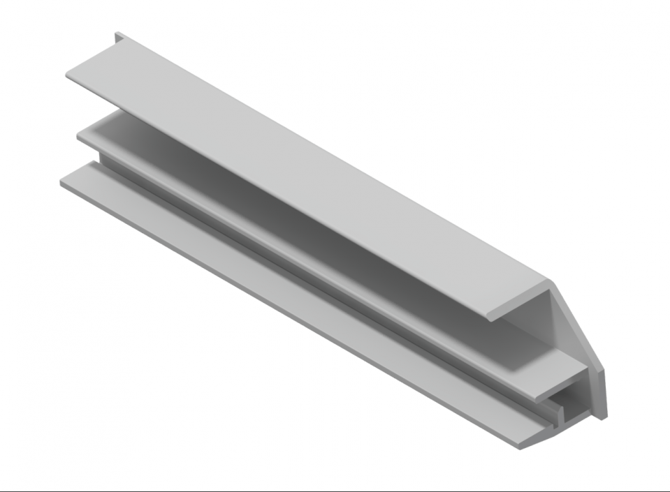
Uniformity is achieved down to the last detail. Aluminium design panels were installed above the shop fronts. Shop owners can place their advertisements on them. This way there is no proliferation of advertisements. On the contrary, the architect says they have become little paintings. Above these aluminium flashing panels, perforated aluminium plates provide natural ventilation. Aluminium can also be found on the brick parapet of the balconies in the form of aluminium wall copings with aluminium balustrades and near the windows, where aluminium sills have been installed. Dana Ponec says she prefers natural materials such as brick and aluminium. “Moreover,” she says, “we were able to use aluminium here in a way that is subordinate to the appearance of the building. That is also a quality of aluminium.” In the architect’s view, subordinate is not the same as modest. "Because then you are selling aluminium short. Aluminium is malleable. You can bend it to your will.”
