Zutphen, Kade Noord Metiushof
Country: NederlandCity: Zutphen
Project name: Kade Noord Metiushof
Type of building: New building
Type of construction: Residential
Contractor:
Heijmans Woningbouw Oost (AMERSFOORT)
Architect:
Zecc Architecten BV (UTRECHT)
ALUMINIUM DETAILING IN THE COLOUR OF THE SURROUNDINGS
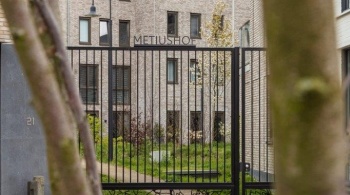
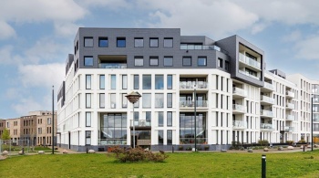
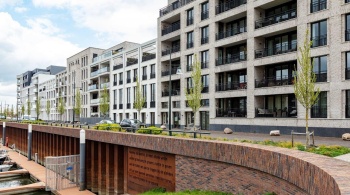
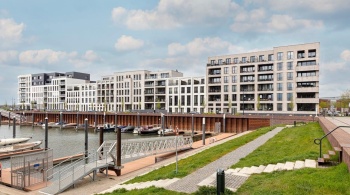
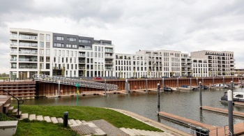
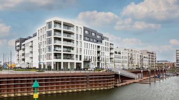
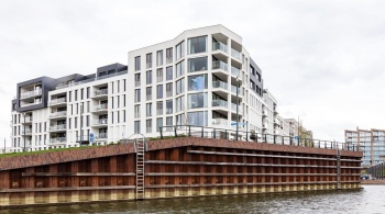
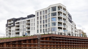
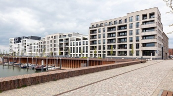
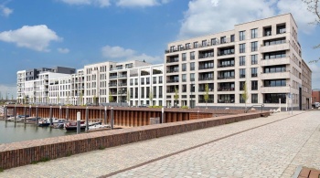
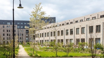
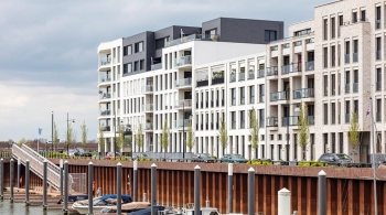
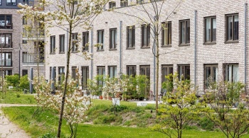
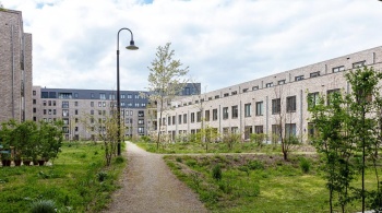
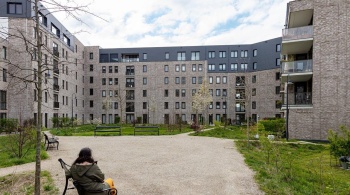
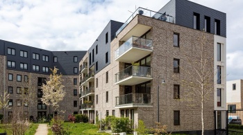
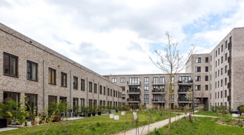
Naturally, this is not the goal in itself: building the monuments of tomorrow. But the prestigious Kade Noord apartment complex in Zutphen, with a view over the river forelands and of the marina, has this potential. The residential complex is part of the urban development plan for Noorderhaven Zutphen, designed by KCAP, the design firm based in Rotterdam that specialises in urban design, architecture and landscape design. The enclosed building block was designed by KCAP, which took on the main block, and by Zecc Architecten from Utrecht, which designed the homes on the right-hand sides that face each other. The landscape architects at KCAP also designed the attractive courtyard garden.
Architect Roeland Pruyt describes the project on behalf of KCAP, while architect Marnix van der Meer does the same on behalf of Zecc Architecten. Van der Meer explains how the collaboration between the two firms came about: “In the past, we worked regularly with Heijmans Vastgoed. The urban development plan was drawn up by KCAP and, at an opportune moment, based on the positive collaboration with Heijmans, our firm was recommended for jointly taking on the design of Kade Noord.”
IJsselfront
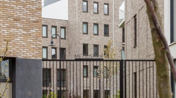
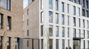
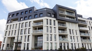
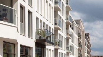
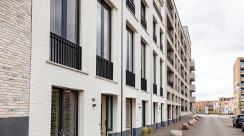
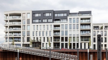
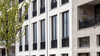
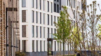
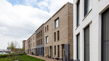
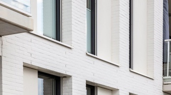
Although this is a new, modern and, however clichéd it may sound, timeless residential building, Kade Noord unmistakably evokes the past. The project is a continuation of the existing IJsselfront, with its characteristic white townhouses with their ash-grey tiled roofs. Marnix van der Meer: “In our design, we made a connection with the white IJsselfront. You can see this link, for example, in the tall windows as well as in the apparent symmetry. And in the colour schemes. The historic townhouses often look symmetrical, but they are not. We have also incorporated that same rhythm into our design. Kade Noord is very much a product of today. It’s not an attempt at historicisation. We have created a design that is durable, sustainable and can last for many years. The aim was to fit in with the historical IJsselfront. That’s why we have opted for materials which are durable and which remain attractive for a long time. That also applies to the aluminium detailing.”
Aluminium detailing
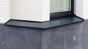
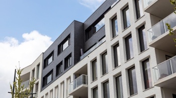
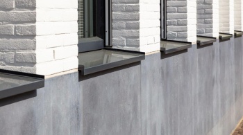
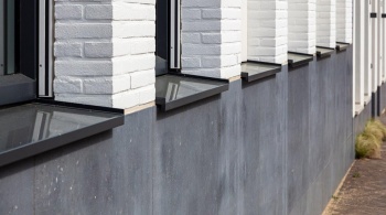
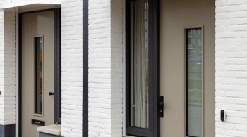
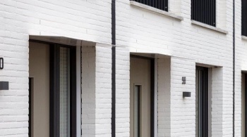
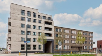
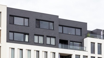
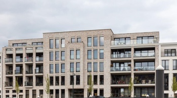
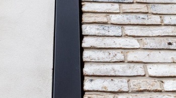
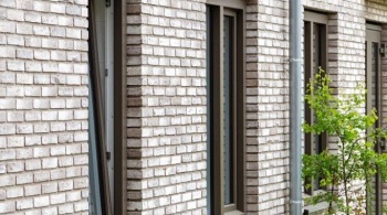
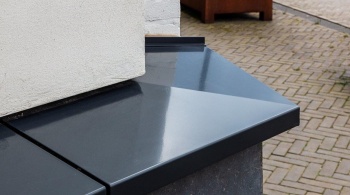
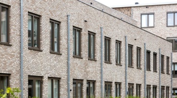
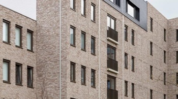
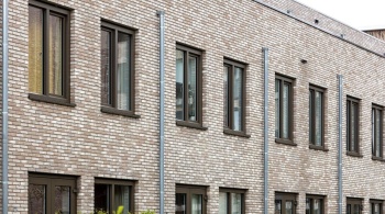
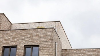
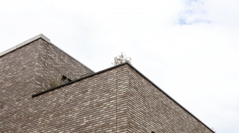
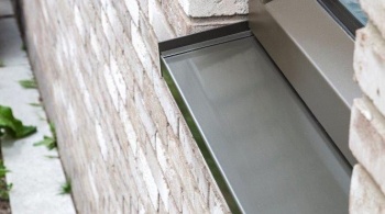
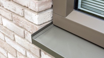
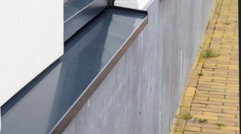
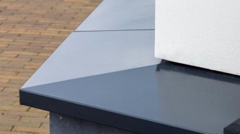
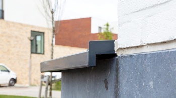
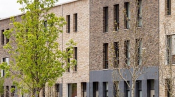
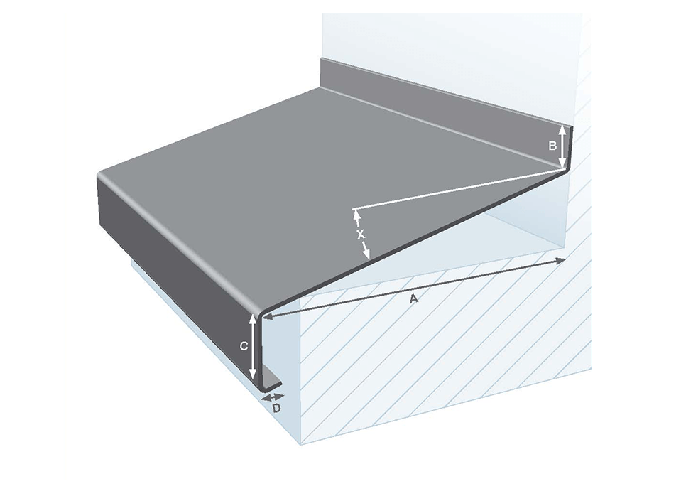
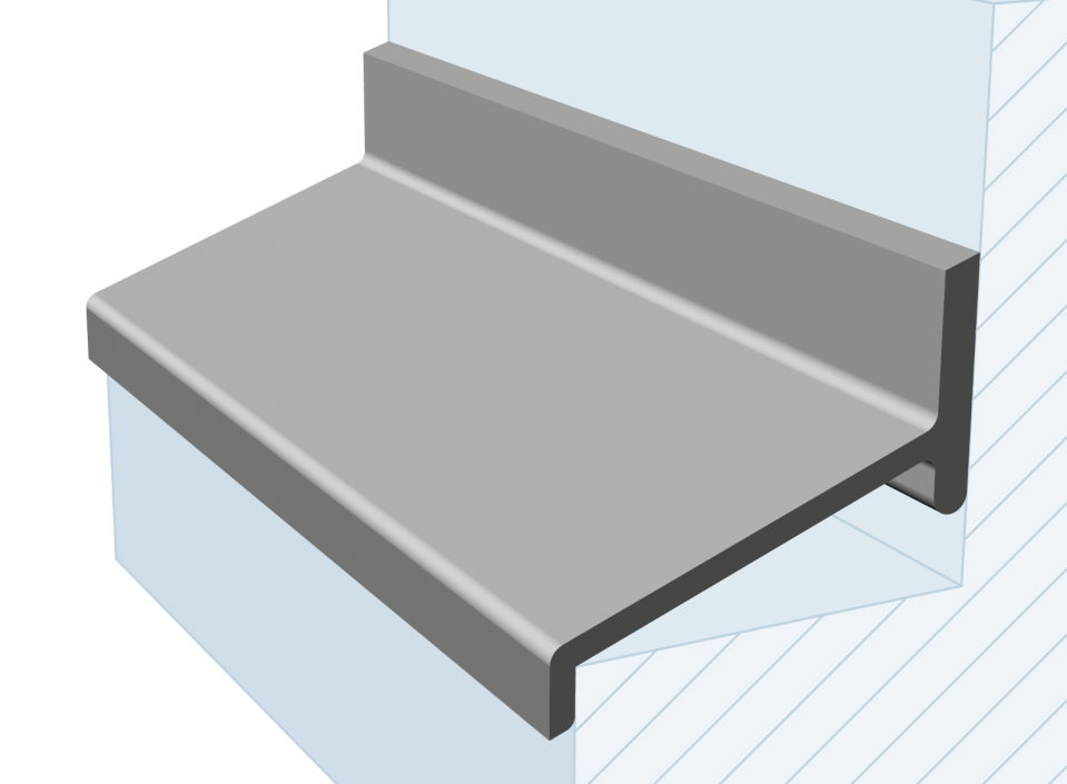
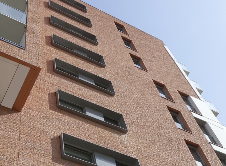
In the blocks designed by Zecc Architecten, aluminium sills have been used, including custom-made sills. The colour of these sills has been matched to the colour of the façade brick. Almost the entire roof edge has been finished with aluminium wall copings. “The entire design has a vast number of details and many different materials are used. We wanted to avoid making it a single, monotonous white block. That is why we opted for various shades of white. By using various materials, you get a sort of layered effect. Aluminium fits in with that. We designed each of the separate blocks such that they borrow something from one another. The rhythm of the windows in one of the townhouses is, for example, reflected in the windows of one of the apartments in the next block. This creates a repeated pattern in the rhythms of the façades. If you take a close look at the historical IJsselkade, you will also see that elements of one building are repeated in the next one.”
Plinth
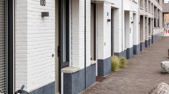
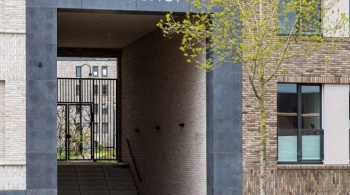
The Kade Noord plinth is made of contrasting Belgian bluestone. “Less prone to getting dirty than white”, says Van der Meer. “The plinth lends prestige to the building and forms the connecting element between the blocks, and particularly with the main block designed by KCAP. Moreover, it accentuates the monumental gate to the courtyard garden and the access to the car park”.
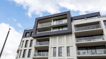
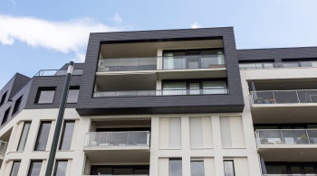
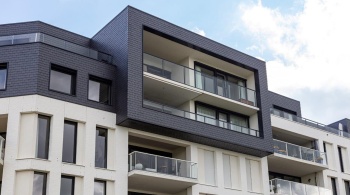
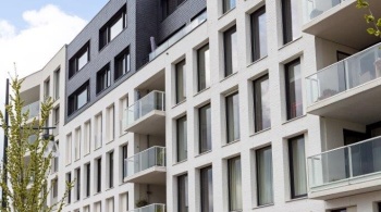
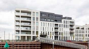
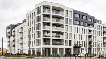
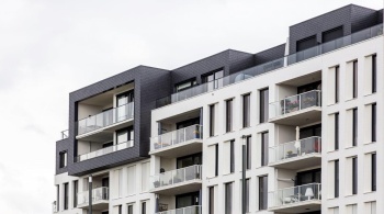
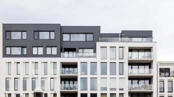
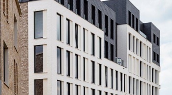
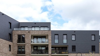
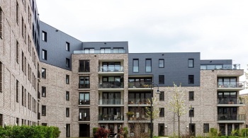
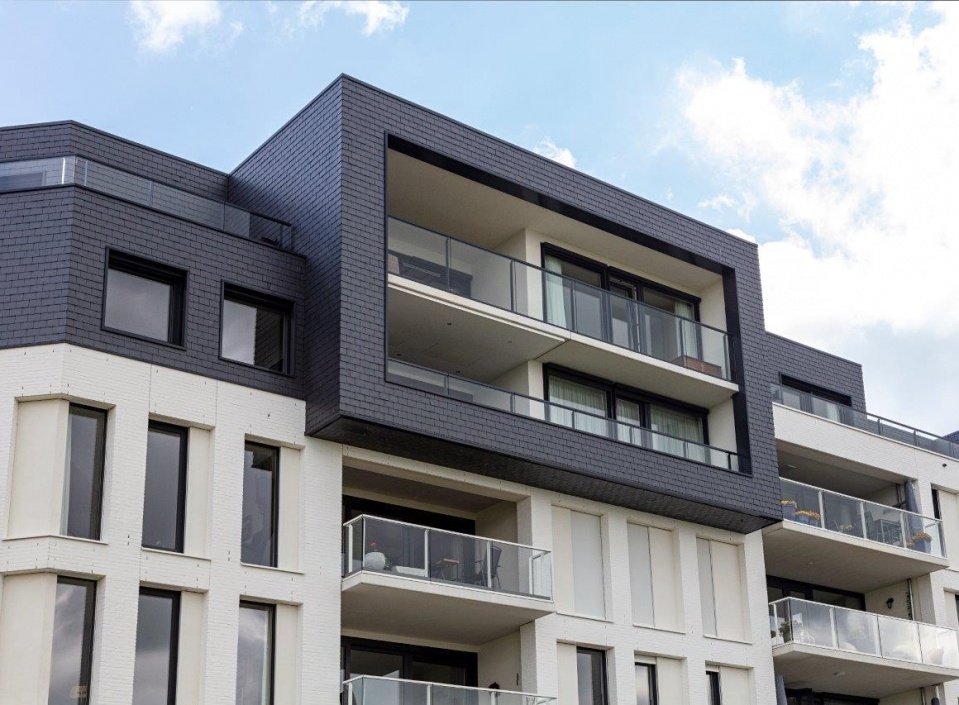
The homes on the IJssel and those located on a section of the marina around the corner were designed by KCAP. Here, too, the reference to the historical IJsselfront is of prime importance. “Our design is a contemporary interpretation of the classic three-part division of plinth, middle section and crown”, explains Roeland Pruyt on behalf of KCAP. “The buildings at the IJsselfront are more or less alike in colour, shape and form. We have retained that in our design. You can read the design as a single whole, with a special corner. The classic three-part division is expressed in the plinth made of Belgian bluestone – also a connecting element between the designs created by the two firms – the white middle section and the grey penthouses, which allude to the grey roofs of the IJsselfront.”
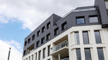
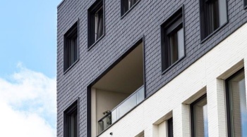
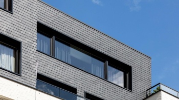
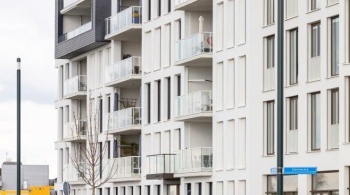
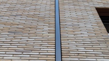
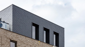
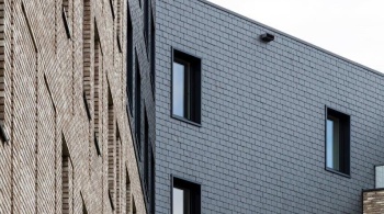
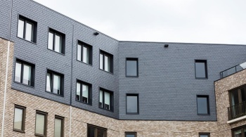
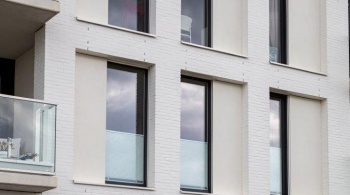
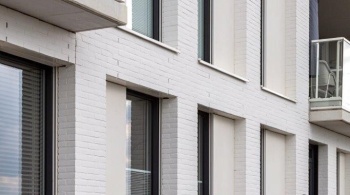
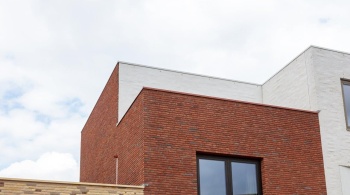
The penthouses are pushed back, leaving room for a roof terrace. This creates a pleasant dynamic in the façade. As regards the materials used, Pruyt says: “The most important material in the crown, the penthouses, are the grey slate tiles. For the middle section, that’s the white painted brickwork and, for the plinth, the Belgian bluestone. The entrances are detailed with anodised aluminium fascia boards in a warm colour. They form a canopy above the entrance as well as a balcony. The same feature can also be seen in traditional construction. You can see that we have mainly focused on themes from the IJsselfront but applied them on a different scale. The distinctive angular shape is finished with white plasterwork and large aluminium windows. Moreover, the frames are concealed behind the plasterwork, creating a larger opening to look out from.” In addition, the grey superstructure features attractive, framed reveals. At certain places on the façade of the complex, the rainwater downpipe has been hidden from view by an aluminium cover profile. A good choice from an aesthetic perspective.
Aluminium wall copings
The roof edge of the part designed by KCAP is also finished with aluminium wall copings. Roeland Pruyt describes these further: “The wall copings are in the same colour as their surroundings. The crown is constructed in grey; the aluminium wall copings used there are in the colour of the slate tiles. The same applies to the aluminium wall copings that connect to the white silicate mineral paint and the aluminium sills.”
With Kade Noord, comprising 134 homes, a car park for 155 cars and a courtyard garden of 4,000 m², KCAP and Zecc have created a stunning residential complex with a feeling for Zutphen’s history and with intelligent nuance. You do not need predictive powers to see that Kade Noord – just like the townhouses on the IJsselfront – gives new inspiration to the architect of tomorrow.
